I dont understands how does these kind of graphs work
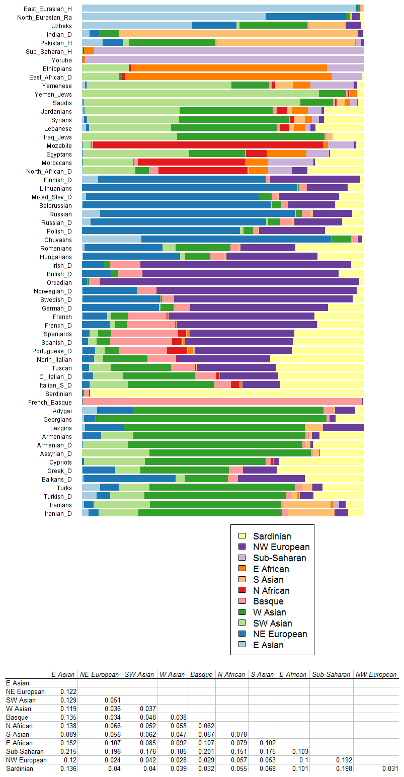
According to this graph, Egyptians are 22% east african and subsaharan, and Moroccans have 24.1% east african and subsaharan (I calculated it). But as you know, black african (just like east asian) is very distinct and dominant in appearance, so having even just 10% or 15% east asian or african black is very obvious on a person's appearance. But most Egyptians and Moroccans look nothing like black african. So how do you explain this graph?
This is what an average Egyptian looks like, these pictures are from a random selection of Egyptians twitter users


I don't see 22% black african, not even 5%. How do you explain the graph?
According to this graph, Egyptians are 22% east african and subsaharan, and Moroccans have 24.1% east african and subsaharan (I calculated it). But as you know, black african (just like east asian) is very distinct and dominant in appearance, so having even just 10% or 15% east asian or african black is very obvious on a person's appearance. But most Egyptians and Moroccans look nothing like black african. So how do you explain this graph?
This is what an average Egyptian looks like, these pictures are from a random selection of Egyptians twitter users
I don't see 22% black african, not even 5%. How do you explain the graph?
")