• Don't want to see ads? Install an adblocker like uBlock Origin or use a Europe-based privacy-friendly browser like Vivaldi or Mullvad.

Economy Economic charts & maps

Maciamo

Veteran member
Admin
Messages
10,650
Reaction score
4,572
Points
113
Location
Lothier
Ethnic group
Italo-celto-germanic
This thread is designed to share interesting charts about economic indicators to compare where countries stand.
1000023242.jpg


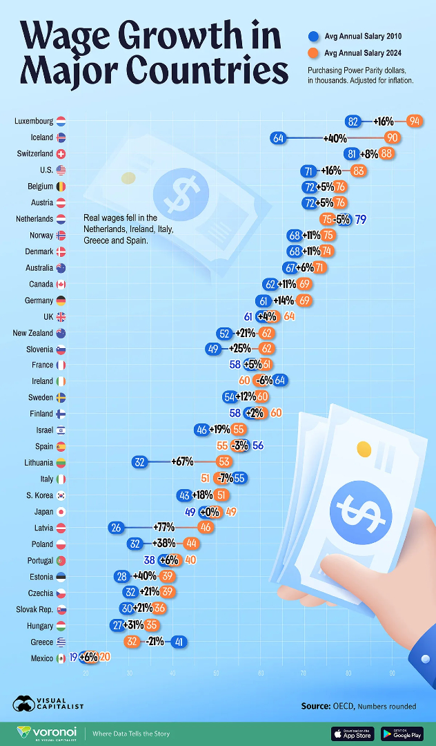
Salaries have increased considerably from 2010 to 2024 in new EU member states. The fastest wage growth were in Latvia (+77%), Lithuania (+67%), Estonia (+40%) and Poland (+38%). Interesting wages in already wealthy Iceland grew slightly faster (+40%) than in Poland.

A few countries that have lower wages now than in 2010: Spain (-3%), the Netherlands (-5%), Ireland (-6%), Italy (-7%) and especially Greece (-21%). Greece was overtaken by 8 countries in 15 years.
1000023236.jpg


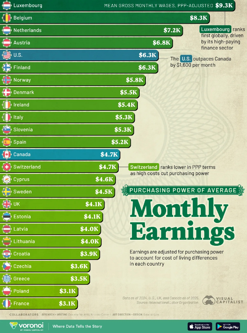
High salaries are one thing, but they don't matter that much is the cost of living is equally high or higher. What matters is purchasing power. Once monthly wages are PPP-adjusted, Switzerland falls form 3rd to 14th position (and Iceland is not even listed below). Belgium, the Netherlands and Austria all overtake the USA. Finland jumps from 19th to 5th position (tied with the US). Surprisingly France falls behind all other EU countries.
1000023241.jpg
 
Last edited:
It could be argued that countries that get richer with more economic inequality have failed society as a whole. The point is not to make a small elite much richer than the rest of the country. This is the typical plight of developing countries but also the United States. In Europe, the United Kingdom is the most unequal country, yet it is only averagely rich, a double failure of sorts. Slovenia is almost as rich as the UK nowadays, but much more equal, meaning that most middle-class Slovenians are better off than middle-class Britons.

1779954882677.jpeg
 
1780468078919.jpeg


People in middle-income developing countries tend to work the longest hours. The richer a country becomes, the less people work so that they can enjoy their life. A good example of this is Italy, where the current average is 15 hours per week per worker. In the U.S. people still work like the average of middle-income countries. Perhaps that's because the quality of life for the poorer half of the US population is no better than in developing countries.
 
I knew Italy's problem was with productivity rather than working hours per se.

View attachment 19652

This chart is the working hours per worker. The one I posted is the working hours per adult (including people who do not work for any reason). Italy has the lowest employment rate in the EU at 62.5% of the working-age population. That's why the working hours per adult are so low.

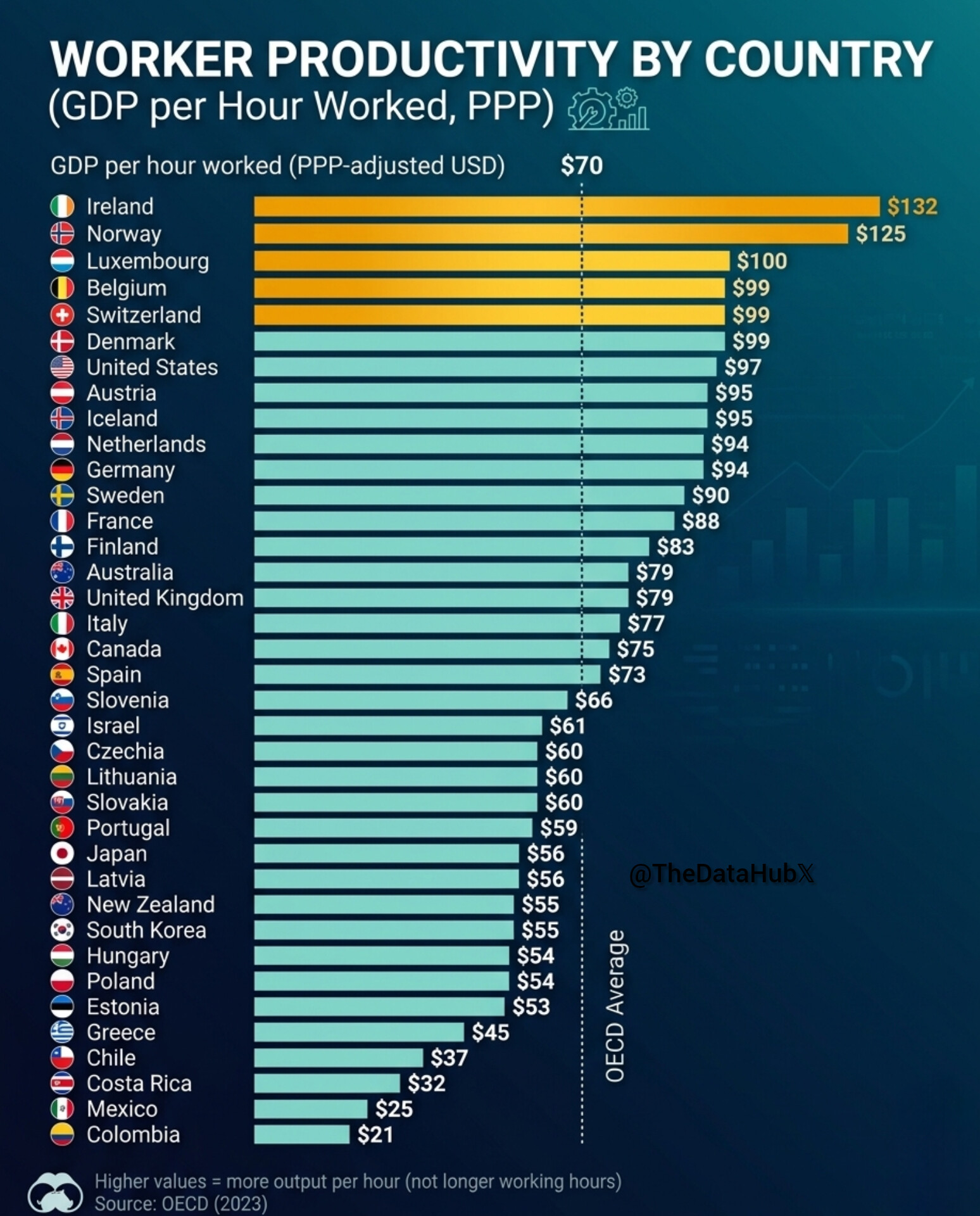
Italy's productivity per worker is not so bad. At $77/h it's comparable to the UK's ($78/h), better than Canada's ($73/h) and much better than Japan's ($56/h) or South Korea's ($54.5/h).
 
Last edited:
Italy has the lowest employment rate in the EU at 62.5% of the working-age population. That's why the working hours per adult are so low.
I see, however I fail to reconcile that with the fact that unemployment rate in Italy is only 5%. Does it highlight that a lot of working-age people are not looking for a job to begin with?
 
I see, however I fail to reconcile that with the fact that unemployment rate in Italy is only 5%. Does it highlight that a lot of working-age people are not looking for a job to begin with?
Yes. There is little relationship between the employment rate and unemployment rate. The latter only includes people officially looking for a job. Women who stay at home are not officially looking for a job, but are also not officially part of the workforce. In countries where more women stay at home, the overall employment rate is always lower. Then there are also people who do not want to work or don't need to work.
 

Patent applications per million inhabitants​


1781628688996.jpeg
 
Yes. There is little relationship between the employment rate and unemployment rate. The latter only includes people officially looking for a job. Women who stay at home are not officially looking for a job, but are also not officially part of the workforce. In countries where more women stay at home, the overall employment rate is always lower. Then there are also people who do not want to work or don't need to work.

Here is the data about the employment rates in Italy by gender, region, and educational attainment (licenza media = middle school ; diploma = high school ; laurea = university degree)

Among those who didn't finish secondary school, there is a huge discrepancy between men (71.7%) and women (37.8%). That's a 34 percentage points gap. Even among high school graduated there is a 21 percentage point gap. In other words, it is especially Italian women who work less than other European women, not Italian men.

1781792604961.jpeg
 
Last edited:
Percentage of NEETs. Once again, it would be useful to have separate data for men and women, as many women in their 20s might just be mothers or homemakers, especially in the Balkans and Turkey.

1782332167181.jpeg
 
Not surprisingly the country with the starkest internal difference is Italy. It should also be considered that a lot of young southern Italians migrate to work in central and especially northern Italy, so a lot of those who stay are those who don't work nor study.
 
Among all European regions, Italy has both the regions with the highest and lowest risk of poverty. The highest in Europe is Sicily with 38.4% of the population at risk of poverty. The lowest is South Tyrol (Alto Adige), with less than 5%.

1782657896503.jpeg
 
For countries with a population over 20 million, Taiwan leads globally for export the values per capita, followed by Germany, Canada and South Korea. The value of exports per person in Taiwan is over four times those of Japan or the United States.

1782658533126.jpeg


However, if we take into account countries with a smaller population, the picture is very different. Singapore, Hong Kong, Switzerland, Ireland and Belgium top the chart. Actually, all top 10 countries for exports per capita, our country's with less than 20 million people (between 3 and 17 million).

1782658729754.jpeg
 
The pay gap between the top earners and bottom earners in the UK has been narrowing over the last 25 years. Not because people at the bottom are earning more, but because people at the top are earning less.

1782744271652.png
 
Wealth per capita by Italian province. People in the wealthiest provinces are in average about four times richer than the poorest. Note that this is not GDP per capita, but accumulated personal wealth/assets.

ricchezza-patrimoniale-pro-capite-v0-mr33oaufcbhc1-3422935215.png
 
Wealth per capita by Italian province. People in the wealthiest provinces are in average about four times richer than the poorest. Note that this is not GDP per capita, but accumulated personal wealth/assets.

View attachment 19769
Compared with other European countries, Italy's wealth is highly uneven geographically.

Northern Italy is broadly comparable to richer continental European regions, while much of Southern Italy is closer to the weaker European periphery.

For example my wife is Spanish and compared with Spain, Italy’s North-South divide appears more structurally entrenched: Spain also has strong regional gaps, but its wealth and growth are less neatly organized along a single north/south fault line.
 
These two charts show the percentage of people who approve of the switch from communism to democracy (top chart) and to market economy (bottom chart) as of 2019. Poles, East Germans and Czechs embraced the change most enthusiastically. The countries most nostalgic for communism, Russia, Ukraine and Bulgaria, are the ones that reformed least. Economic success is first a mindset.

1783145898972.jpeg
 

Evolution of wealth inequalities in European countries from 2010 to 2021​

In countries like Austria, the Netherlands, or Ireland, the lower and lower middle classes (bottom 40%) and middle classes (next 50%) are getting richer, while the upper middle and upper classes (top 10%) are getting poorer. The opposite is happening in Spain and Finland. In France there has been virtually no change over this 12-year period.

1783238117532.jpeg
 
1783582046009.jpeg


Gross Fixed Capital Formation (GFCF)—often simply referred to as "investment" in economic terms—measures how much money an economy is actively putting into productive assets like machinery, buildings, and infrastructure, rather than immediate consumption. Because it isolates new and second-hand fixed assets while excluding non-produced assets (like raw land or financial products), GFCF is a powerful indicator of a region's confidence in its future growth.

A rising trend line on a chart usually indicates that businesses and governments are aggressively expanding their productive capacity (like buying factory equipment or building roads). Conversely, a downward trend often highlights periods of economic caution, where entities are hesitant to make long-term financial commitments.

South Korea is clearly leading in GFCF among rich countries. The highest in Europe is Estonia (usually 28 to 30%), which is not shown on the chart above.

Among Western countries, we can see that Belgium has maintained the highest GFCF over the last 15 years on the chart. Other countries with also high GFCF include Switzerland, Austria, Czechia and Hungary.

It's interesting to see how France used to have a level as high as South Korea in 2006-7, but has since dropped to the second lowest level among the countries on the chart.

The UK is the last by a white margin on the chart, but there are three other European countries with even lower GFCF: Poland, Bulgaria, and Greece.

This is for this selection of developed countries. You can see the full list of countries by GFCF. In 2022-2023 the countries with the highest GFCF in the world were China and Tanzania, both at 42%, while the lowest was Sudan at a mere 2%.
 
Last edited:
Back
Top